1. Download
Before downloading, be sure to have a code editor (we recommend Sublime Text 2) and some working knowledge of HTML and CSS. We won't walk through the source files here, but they are available for download. We'll focus on getting started with the compiled Bootstrap files.
Download compiled
Fastest way to get started: get the compiled and minified versions of our CSS, JS, and images. No docs or original source files.
Download source
Get the original files for all CSS and JavaScript, along with a local copy of the docs by downloading the latest version directly from GitHub.
2. File structure
Within the download you'll find the following file structure and contents, logically grouping common assets and providing both compiled and minified variations.
Once downloaded, unzip the compressed folder to see the structure of (the compiled) Bootstrap. You'll see something like this:
  bootstrap/
  ├── css/
  │   ├── bootstrap.css
  │   ├── bootstrap.min.css
  ├── js/
  │   ├── bootstrap.js
  │   ├── bootstrap.min.js
  └── img/
      ├── glyphicons-halflings.png
      └── glyphicons-halflings-white.png
This is the most basic form of Bootstrap: compiled files for quick drop-in usage in nearly any web project. We provide compiled CSS and JS (bootstrap.*), as well as compiled and minified CSS and JS (bootstrap.min.*). The image files are compressed using ImageOptim, a Mac app for compressing PNGs.
Please note that all JavaScript plugins require jQuery to be included.
3. What's included
Bootstrap comes equipped with HTML, CSS, and JS for all sorts of things, but they can be summarized with a handful of categories visible at the top of the Bootstrap documentation.
Docs sections
Scaffolding
Global styles for the body to reset type and background, link styles, grid system, and two simple layouts.
Base CSS
Styles for common HTML elements like typography, code, tables, forms, and buttons. Also includes Glyphicons, a great little icon set.
Components
Basic styles for common interface components like tabs and pills, navbar, alerts, page headers, and more.
JavaScript plugins
Similar to Components, these JavaScript plugins are interactive components for things like tooltips, popovers, modals, and more.
List of components
Together, the Components and JavaScript plugins sections provide the following interface elements:
- Button groups
- Button dropdowns
- Navigational tabs, pills, and lists
- Navbar
- Labels
- Badges
- Page headers and hero unit
- Thumbnails
- Alerts
- Progress bars
- Modals
- Dropdowns
- Tooltips
- Popovers
- Accordion
- Carousel
- Typeahead
In future guides, we may walk through these components individually in more detail. Until then, look for each of these in the documentation for information on how to utilize and customize them.
4. Basic HTML template
With a brief intro into the contents out of the way, we can focus on putting Bootstrap to use. To do that, we'll utilize a basic HTML template that includes everything we mentioned in the File structure.
Now, here's a look at a typical HTML file:
- <!DOCTYPE html>
- <html>
- <head>
- <title>Bootstrap 101 Template</title>
- <meta name="viewport" content="width=device-width, initial-scale=1.0">
- </head>
- <body>
- <h1>Hello, world!</h1>
- <script src="https://code.jquery.com/jquery.js"></script>
- </body>
- </html>
To make this a Bootstrapped template, just include the appropriate CSS and JS files:
- <!DOCTYPE html>
- <html>
- <head>
- <title>Bootstrap 101 Template</title>
- <meta name="viewport" content="width=device-width, initial-scale=1.0">
- <!-- Bootstrap -->
- <link href="css/bootstrap.min.css" rel="stylesheet" media="screen">
- </head>
- <body>
- <h1>Hello, world!</h1>
- <script src="https://code.jquery.com/jquery.js"></script>
- <script src="js/bootstrap.min.js"></script>
- </body>
- </html>
And you're set! With those two files added, you can begin to develop any site or application with Bootstrap.
5. Examples
Move beyond the base template with a few example layouts. We encourage folks to iterate on these examples and not simply use them as an end result.
-
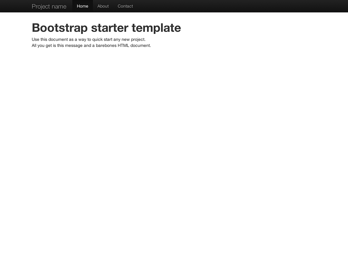
Starter template
A barebones HTML document with all the Bootstrap CSS and JavaScript included.
-
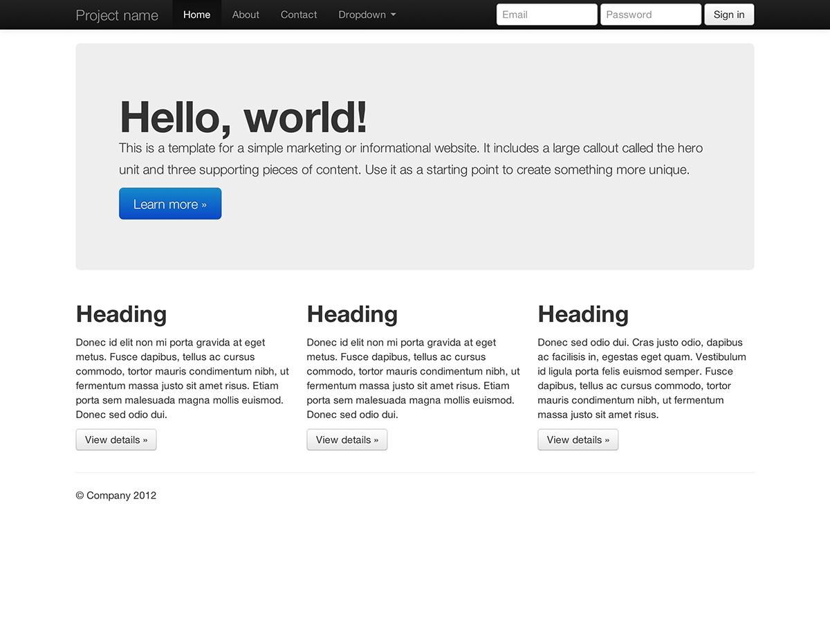
Basic marketing site
Featuring a hero unit for a primary message and three supporting elements.
-
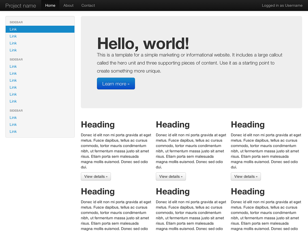
Fluid layout
Uses our new responsive, fluid grid system to create a seamless liquid layout.
-
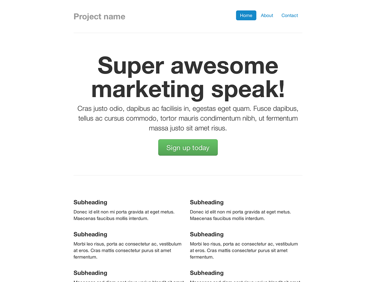
Narrow marketing
Slim, lightweight marketing template for small projects or teams.
-
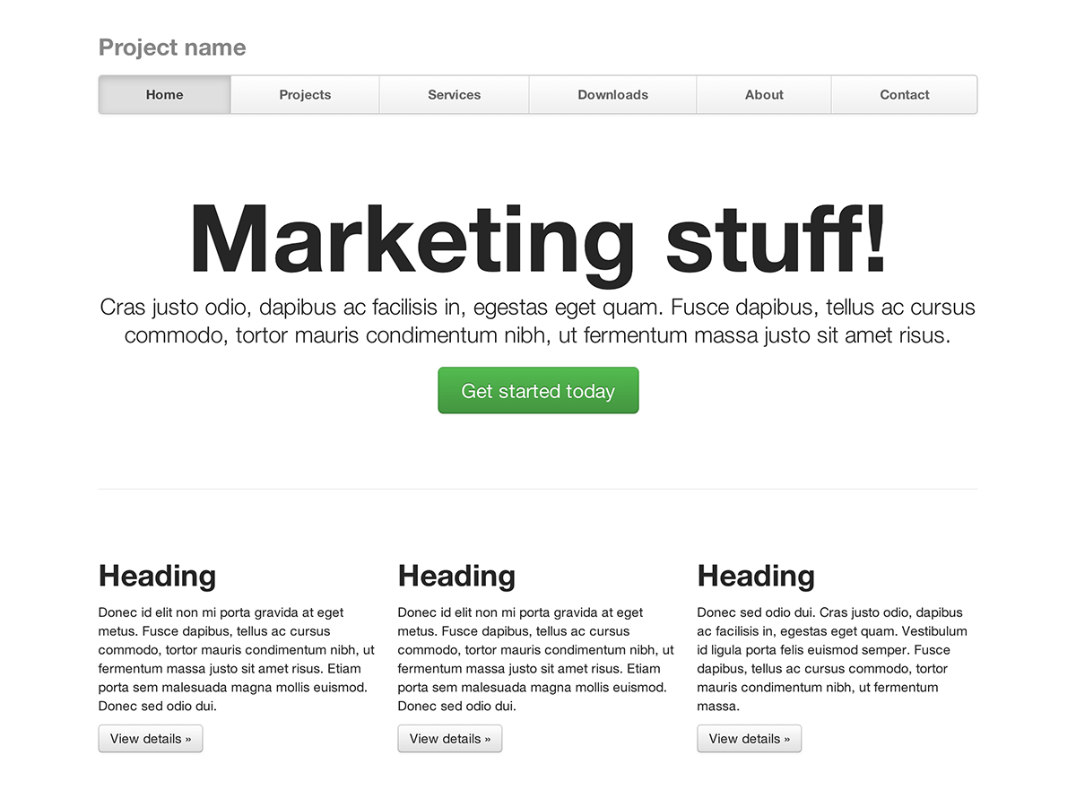
Justified nav
Marketing page with equal-width navigation links in a modified navbar.
-
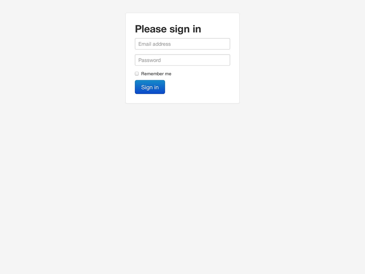
Sign in
Barebones sign in form with custom, larger form controls and a flexible layout.
-
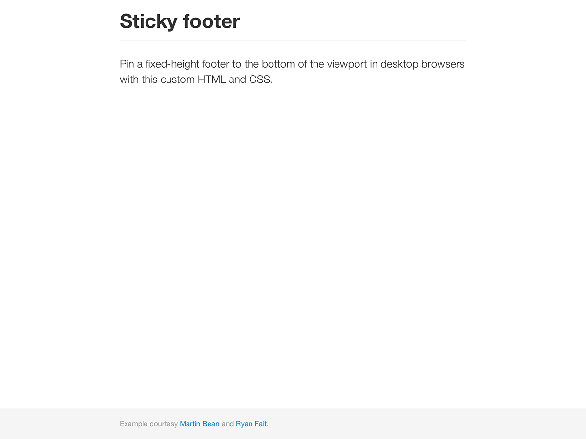
Sticky footer
Pin a fixed-height footer to the bottom of the user's viewport.
-
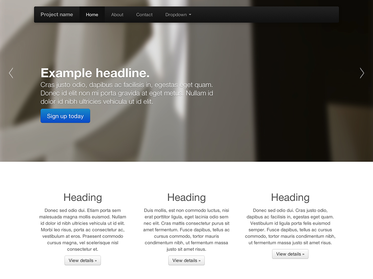
Carousel jumbotron
A more interactive riff on the basic marketing site featuring a prominent carousel.
What next?
Head to the docs for information, examples, and code snippets, or take the next leap and customize Bootstrap for any upcoming project.
Visit the Bootstrap docs Customize Bootstrap